 Previously, I wrote a bit on how news can be presented, both positively and negatively. At the time, I ended by saying I would go into the history of news graphics and presentation, but have since changed my mind on what I would base this on. I was watching the news on TV this whole evening and night, primarily MSNBC with some CNN and Headline News, or rather HLN as they are now called, thrown in, when I came to the realization.
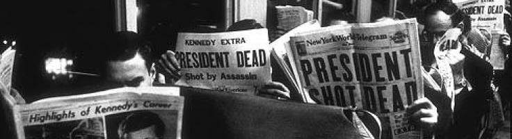
As much as I enjoy televised news, they really are bombarding us with graphics and presentations.
Everything’s Better With Graphics!
In my previous article, I mentioned how one must take care to not go overboard with information. Yes, people want information, this is true,  but people want that information coming at them at a speed at which they can actually process it.
If you’ve ever watched a news program, whether it be a mid-day news report on MSNBC, Issues with Jane Valez-Mitchell, or some other talking head, you’ve surely seen some variant of the news ticker screen graphic.
In theory, it is a decent idea. While the talking head blabbers on about how many mistresses Tiger Woods had or some other tripe, the channel will run small story bits along the bottom of the screen so you can be up to date about other goings on. Its efficiency!
Or it would be, except that some channels run the words across the screen at a higher rate of speed than you can truly comprehend. Or you may be distracted by whatever the talking head of the moment is saying and only catch part of what it said. Lewis Black said it best regarding this, “So you could only pick up things like “Terror in your neighborhood”-What the ****? “…giant dung beetle…could cause scabbing.””
Change is Good?
 Sometimes a news channel will change the graphics it uses. This may be due to rebranding or some other reason. Recently, MSNBC went through just such a change when it went HD. Gone were the angled red, blue, and gold of old. In came a new design that was both simple yet complicated. The news ticker along the bottom now found itself joined by a bar on top of it that often included information important to whatever the talking head was saying. This bar could also show things such as how the Dow Jones had been doing that day.
Furthermore, sometimes they would add in a graphic to the far right of the screen, adding in even more information. This could be things such as, in the above picture, the schedule for that evening, the weather, and so on.
For me, it took some time to adapt but I do have to admit that, despite how cluttered it can get at times, the information is displayed a bit better than previously. Of particular note is the new news ticker. While it still cycles through various news bits, it now also shows the category for  which they belong to, so even if you don’t get the whole message, at least you are left with some idea of what it was.
Balancing Act
Going back to my previous article, I do have to concede that it is a very hard balancing act. On the one hand, journalists want to give the people as much information as they can possible handle, but on the other hand people can only process so much at a time before being overloaded. Over time, it is obvious that the graphics of news channels will continue to be tweaked. MSNBC’s recent change with the HD conversion is a good indicator of that. While I have my own complaints about it, I can also see what they are going for, so I can’t really blame them for trying.
And I am sure, when a news channel, HLN, Fox News, MSNBC, or someone else, finally finds that balance, something new will come along to screw it all up. That’s the way things go, really.
Leave a response